︎BRAND/COLLATERAL/WEB/CARDS.
Chicago Screens.
AN ALL-NEW FACETS-LED INITIATIVE THAT WILL HELP CHICAGO AREA FILM FESTIVALS ADD TO THE CULTURAL AND ECONOMIC VITALITY OF OUR COMMUNITIES THROUGH SECTOR BUILDING EFFORTS CURRENTLY COMPRISED OF 45 ORGANIZATIONS.
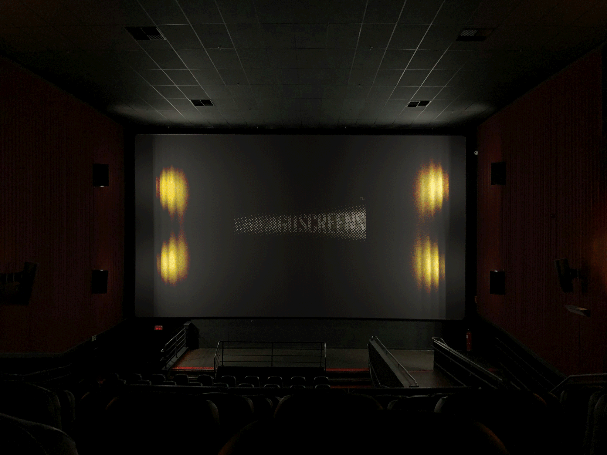
“I still remember when I first went to see a movie as a kid - I was amazed when I walked into that enormous dark room and later saw the little window behind me throw out a beam of light that sliced the space. Then I saw what that beam delivered and I was stunned.”
This branding captures that emotion, which represents the one symbol that unifies every movie enthusiast, regardless of style, genre or sector. It is used to premiere a movie and experience a movie.
When you see it, you know something magical and exciting is about to happen.
The “square” is the dark theatre room. The “projection” slices the square, and turns it into a graphic letter “C” - creating the complete brand message. The “C” representing “Chicago”, and the projection representing “Screens” - and as shown below, the typology also takes on the shape of the projection as well, giving us a singular and ownable opportunity where the screen projection forms the letter “C”.